Home › Computers › Responsive Layouts: Flex, Grid and Multi-Column

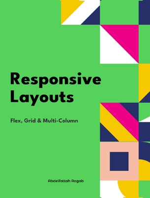
Responsive Layouts: Flex, Grid and Multi-Column

by Abdelfattah Ragab

Three approaches to responsive web layout

Regular price $50.11 USD
Regular price $83.52 USD Sale price $50.11 USD
Save 40%

Hardcover New

Delivery to your door
In stock·Dispatches in 1–2 business days
Standard shipping* from $4.35
Standard shipping transit* 5–8 business days after dispatch

Faster options are available.

Rates and delivery estimates depend on your destination and item quantity. Estimates are informational only; the final shipping method and rate are selected at checkout.

Secure checkout
American Express Apple Pay DiscoverGoogle Pay Mastercard PayPalVisa
30-day eligible returns Returns & refunds policy

AlbakiReads Editorial

Three approaches to responsive web layout

Abdelfattah Ragab’s guide compares Flexbox, Grid, and multi-column layout through the different ways they arrange content: in one dimension, across two dimensions, or in flowing text columns. The description says the book explains the properties and values for each approach and how they affect the placement of elements on screen. Its scope connects general interface layout with the column-based format associated with magazines and newspapers, giving the book a practical focus on choosing and configuring CSS layout tools.

Good fit for readers who enjoy

  • Web developers learning or reviewing CSS layout methods
  • Readers seeking an overview of Flexbox, Grid, and multi-column layouts

Themes

Responsive web designCSS layout methodsContent distribution on screen

Based on publisher information and book metadata.

Book overview

In this book, I will explain the three best-known responsive layouts: the flexbox, the grid and the multi-column layout. Flexbox is a one-dimensional layout that only works in one dimension at a time, either horizontally or vertically. The grid layout is a two-dimensional layout that distributes the elements horizontally and vertically at the same time. The multi-column layout is a special layout for magazines and newspapers where the text should flow in columns with spacing, rules and so on. I'll explain all the properties and their values and how they affect the distribution of elements on the screen. Let's get started.
Shipping & returnsShipping options, delivery timing, and our return policy.

In-stock items normally dispatch within 1–2 business days. The ZIP-code estimator on this page is informational only; the final shipping method, price, and availability are confirmed at checkout for your full order.

For the initial delivery estimate we use these transit windows after dispatch: Standard 5–8 business days, Expedited 2–4 business days, and Priority 1–2 business days. Holiday delays are not included.

Eligible items can be returned within 30 days in accordance with our return policy.

Customer reviews