


Helvetica and the New York City Subway System: The True (Maybe) Story
Regular price
$37.21 USD
Regular price
$62.02 USD
Sale price
$37.21 USD
Unit price
per
You save $24.81 USD (40%)
In stock — Ships within 1–2 business days
Format
Print Book
Currently viewing
Hardcover
$37.21 USD
$62.02 USD
Secure CheckoutYour data is protected
Fast U.S. ShippingShips within 1–2 business days
Authentic Titles100% Genuine Books
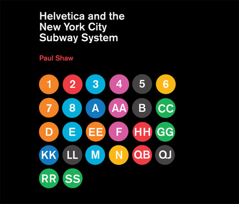
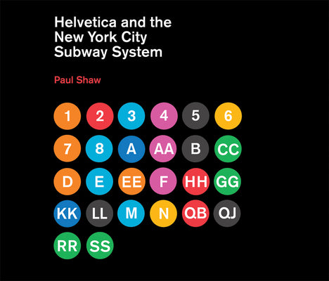
Book Overview How New York City subways signage evolved from a "visual mess" to a uniform system with Helvetica triumphant.For years, the signs in the ...
How New York City subways signage evolved from a "visual mess" to a uniform system with Helvetica triumphant.
For years, the signs in the New York City subway system were a bewildering hodge-podge of lettering styles, sizes, shapes, materials, colors, and messages. The original mosaics (dating from as early as 1904), displaying a variety of serif and sans serif letters and decorative elements, were supplemented by signs in terracotta and cut stone. Over the years, enamel signs identifying stations and warning riders not to spit, smoke, or cross the tracks were added to the mix. Efforts to untangle this visual mess began in the mid-1960s, when the city transit authority hired the design firm Unimark International to create a clear and consistent sign system. We can see the results today in the white-on-black signs throughout the subway system, displaying station names, directions, and instructions in crisp Helvetica. This book tells the story of how typographic order triumphed over chaos.
The process didn't go smoothly or quickly. At one point New York Times architecture writer Paul Goldberger declared that the signs were so confusing one almost wished that they weren't there at all. Legend has it that Helvetica came in and vanquished the competition. Paul Shaw shows that it didn't happen that way--that, in fact, for various reasons (expense, the limitations of the transit authority sign shop), the typeface overhaul of the 1960s began not with Helvetica but with its forebear, Standard (AKA Akzidenz Grotesk). It wasn't until the 1980s and 1990s that Helvetica became ubiquitous. Shaw describes the slow typographic changeover (supplementing his text with more than 250 images--photographs, sketches, type samples, and documents). He places this signage evolution in the context of the history of the New York City subway system, of 1960s transportation signage, of Unimark International, and of Helvetica itself.
Book Details Format: Hardcover | Pages: 144 | Language: English | Publisher: MIT PR | ISBN: 026201548X
FormatHardcover
Pages144
LanguageEnglish
ISBN026201548X
EAN9780262015486
PublisherMIT PR
Publication Date1970-01-01
Edition1
AccessoriesNo Accessory
ConditionNew
Product TypeHARD COVER BOOKS
Weight2.3 Pounds
Length9.72 Inches
Width11.3 Inches
Height0.76 Inches
Shipping & Returns Fast, reliable shipping and easy returns on eligible items.
Most orders ship within 1–2 business days with fast, reliable U.S. delivery.
Eligible items can be returned within 30 days in line with our store return policy.
Why shop with AlbakiReads
Fresh Inventory from Major Publishers
Sourced through trusted book distributors, with fresh titles added regularly.
Secure Checkout
Your payment information is encrypted and protected every step of the way.
Fast U.S. Shipping
Most orders ship within 1–2 business days.
Books for Every Kind of Reader
From page-turners to timeless classics—find your next favorite read.


